Yaksha
A new entrant in India's premium whisky market came to The Brand Ops with an ambition and a constraint.

Services:
Branding, Visual Identity, Verbal Identity
Industry:
Beverages industry
Timeline
8 Week
Yaksha Whisky
An ancient guardian. A modern spirit. A brand engineered at the intersection of mythology and whisky.
The Brief
A new entrant in India's premium whisky market came to The Brand Ops with an ambition and a constraint.
The ambition: Create a whisky brand that doesn't look, feel, or behave like anything else on the shelf. Not another "Scottish heritage" knockoff. Not another "bold and masculine" cliché. Something rooted in India's own mythological depth yet unmistakably modern, global, and premium.
The constraint: India's whisky market is one of the largest in the world and one of the most saturated. Over 100 brands fight for shelf space. The visual language has calcified into predictable patterns: dark labels, gold crests, faux-European heritage, aggressive masculine typography. Everything looks like everything else.
The Core challenge:
How do you create a whisky brand that is authentically Indian, mythologically rich, visually unprecedented and commands a premium shelf position against established players with decades of brand equity?
Phase 1: Discover
Weeks 1–3 Before we designed anything, we understood everything.
What We Uncovered
Before opening any design tool, we spent three weeks in deep strategic discovery understanding the market, the mythology, the consumer psychology, and the gap between what exists and what could exist.
What we found:
We audited 40+ whisky brands available in the Indian market from mass-market to premium. The findings were damning:
Visual Element | % of Brands Using It |
|---|---|
Gold/Black color scheme | 78% |
European heraldic imagery (crests, shields, lions) | 65% |
Serif/script "heritage" typography | 72% |
References to Scotland/European tradition | 58% |
Masculine/aggressive positioning | 81% |
The insight:
India is the world's largest whisky market yet almost no Indian whisky brand draws from India's own cultural depth. The entire category has outsourced its identity to European aesthetics. This isn't just a design problem it's an identity crisis.
The opportunity:
A brand that is unapologetically rooted in Indian mythology not as a gimmick, but as genuine cultural DNA would have ZERO visual competition on the shelf. It wouldn't just stand out. It would exist in a category of one.
Discovery 2:
The Mythology of Yaksha A Brand Story Written 3,000 Years Ago
We spent an entire week researching the mythological foundation. Not as decoration as brand architecture.
What we found about Yakshas:
Dimension | Mythological Truth | Brand Translation |
|---|---|---|
Role | Guardians of hidden treasures buried in the earth and roots of trees | The brand guards a premium, complex spirit a "hidden treasure" |
Nature | Nature spirits connected to trees, water, earth, fertility | Direct link to whisky's ingredients: grain, water, wood (cask) |
Character | Benevolent but powerful; generous but not to be underestimated | Brand personality: generous, inviting, but with depth and potency |
Appearance | Adorned with jewelry, depicted as divine beings of abundance | Visual language: ornate, rich, abundant not minimal, not austere |
Offerings | Associated with Soma — the sacred Vedic elixir of the gods | The whisky IS the modern Soma a divine offering, not just a drink |
The insight:
The Yaksha mythology isn't just a name. It's a complete brand world. It provides the character (the guardian), the story (the offering of treasure), the personality (generous, mystical, powerful), and the ritual (the sacred act of drinking). No other whisky brand in India has this depth of narrative DNA.
Discovery 3: The Consumer Beyond "Whisky Drinker"
We profiled the target consumer through interviews and market analysis:
The YAKSHA Consumer:
Attribute | Profile |
|---|---|
Age | 28–45 |
Mindset | Culturally confident. Doesn't need European validation. Proud of Indian heritage but lives a global lifestyle. |
Drinking Behavior | Transitioning from volume drinking to considered drinking. Cares about story, craft, provenance. |
Brand Psychology | Wants to discover brands, not follow them. Gravitates toward the unusual, the authentic, the layered. |
Visual Sensibility | Appreciates craft and detail. Responds to richness and complexity — NOT minimalism. Sees minimalism as lazy, not premium. |
The Trigger | Picks up a bottle because it stops them. Buys it because the story on the back confirms what the front promised. |
The insight:
The YAKSHA consumer doesn't want "another whisky." They want an artifact. Something that feels discovered, not marketed. Something that rewards attention the more you look, the more you see. The more you learn, the more you respect.
Discovery 4: Strategic Positioning
After three weeks of immersion, we locked the brand's strategic position:
Category: Premium Indian Whisky
Positioning Statement:
YAKSHA is the first premium Indian whisky that draws its identity entirely from India's own mythological depth positioning the spirit not as a beverage, but as a sacred offering from nature's guardian to the modern connoisseur.
Brand Archetype: The Magician × The Sage
The Magician: Transformation, alchemy, making the extraordinary from the ordinary
The Sage: Knowledge, depth, truth, authenticity
Brand Personality:
Trait | Expression |
|---|---|
Mystical | Not fantasy — grounded mysticism. Ancient knowledge, not fairy tales. |
Generous | The Yaksha offers. The brand gives. Every touchpoint is abundant, rich, layered. |
Potent | Quiet power. Not loud. Not aggressive. The strength that doesn't need to announce itself. |
Authentic | Rooted in real mythology, real craft, real ingredients. Nothing fabricated. |
Elevated | Premium without pretension. Sacred without being inaccessible. |
Brand Voice:
Element | Description |
|---|---|
Tone | Reverent but not religious. Poetic but not flowery. Confident but not arrogant. |
Language Level | Elevated but accessible. A storyteller at a firepit, not a professor at a lectern. |
Signature Phrases | "Offered, not served." / "From the guardian, to the glass." / "Nature's hidden treasure, unguarded." |
The Strategic Foundation Document was delivered at the end of Week 3. The client's response:
"We came in thinking we were building a whisky brand. You showed us we're building a mythology."
Phase 2: Design
Weeks 4–6 Making strategy visible.
The Design Philosophy
With the strategy locked, our design mandate was clear:
Create a visual identity that is impossible to confuse with any other whisky on the shelf one that rewards attention, deepens with study, and transforms the act of pouring a drink into a ritual.
Every design decision that followed was measured against this mandate. If it didn't serve the story, it didn't survive.
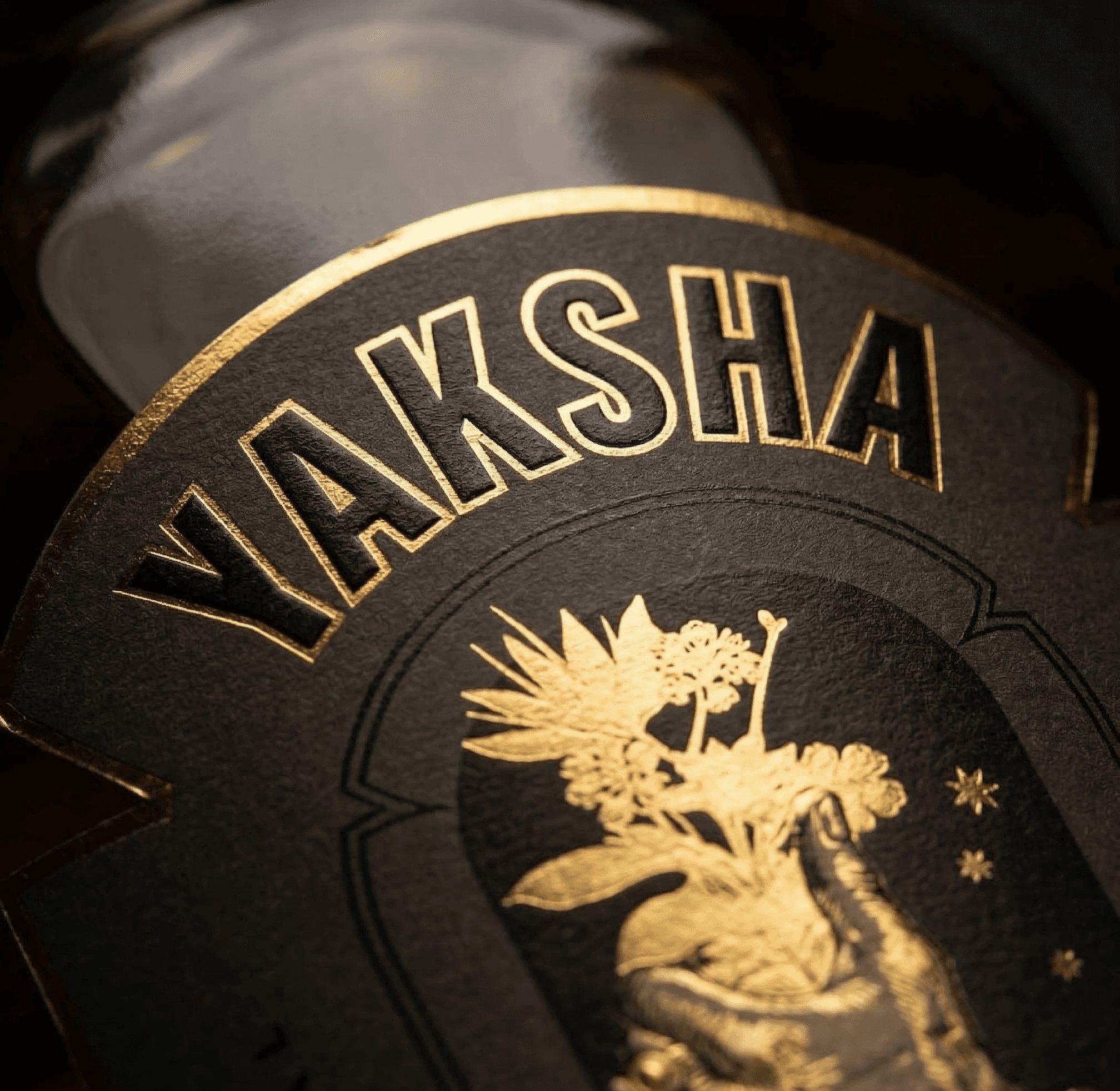
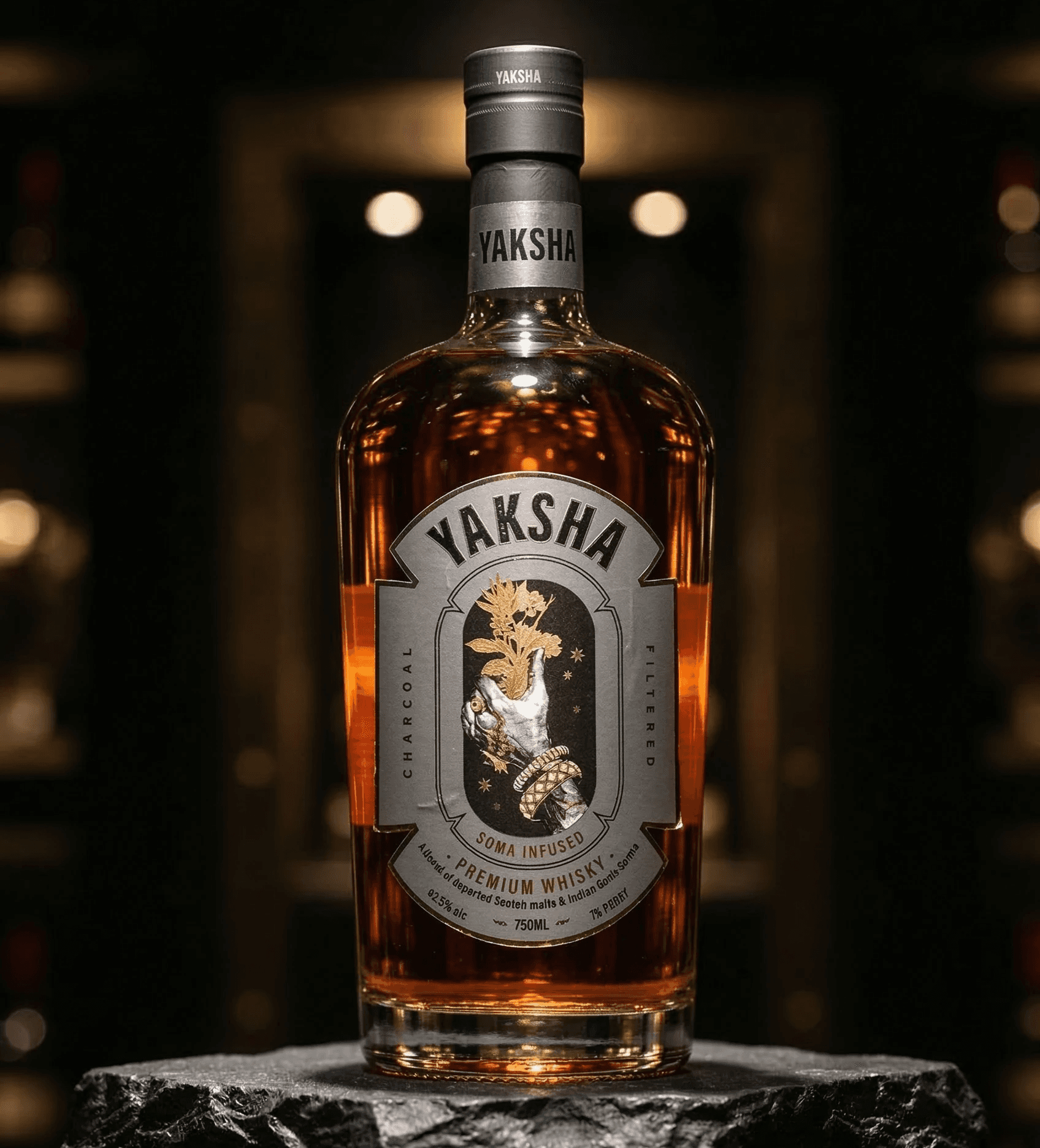
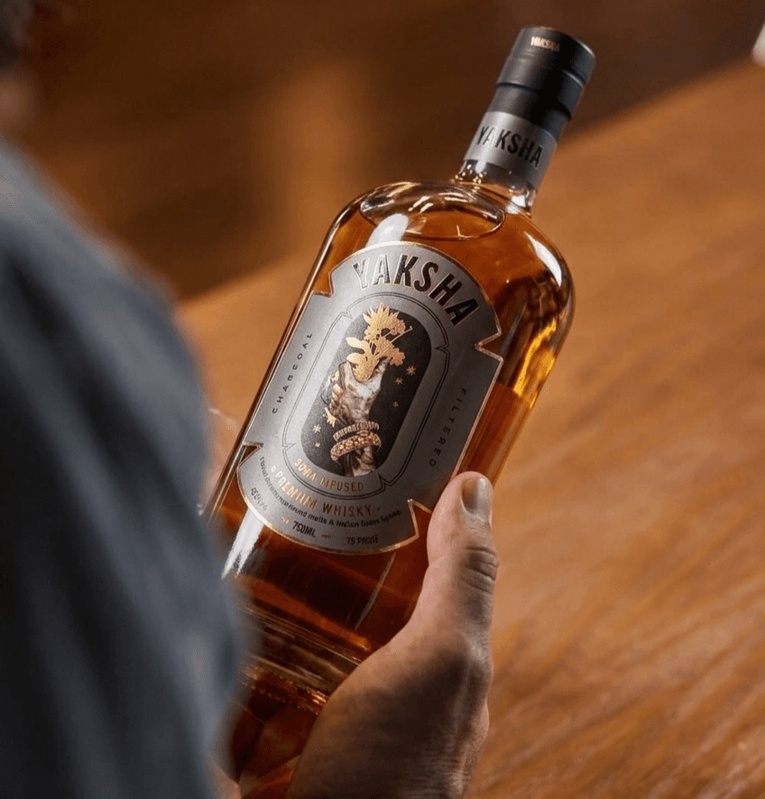
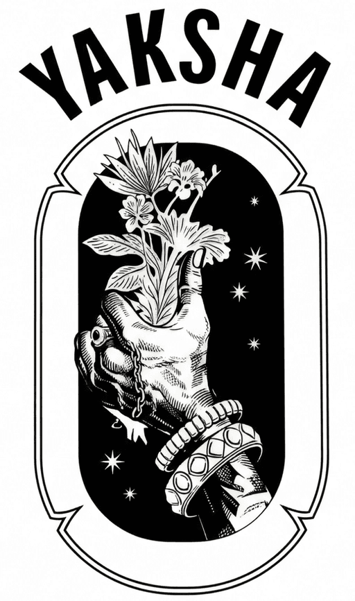
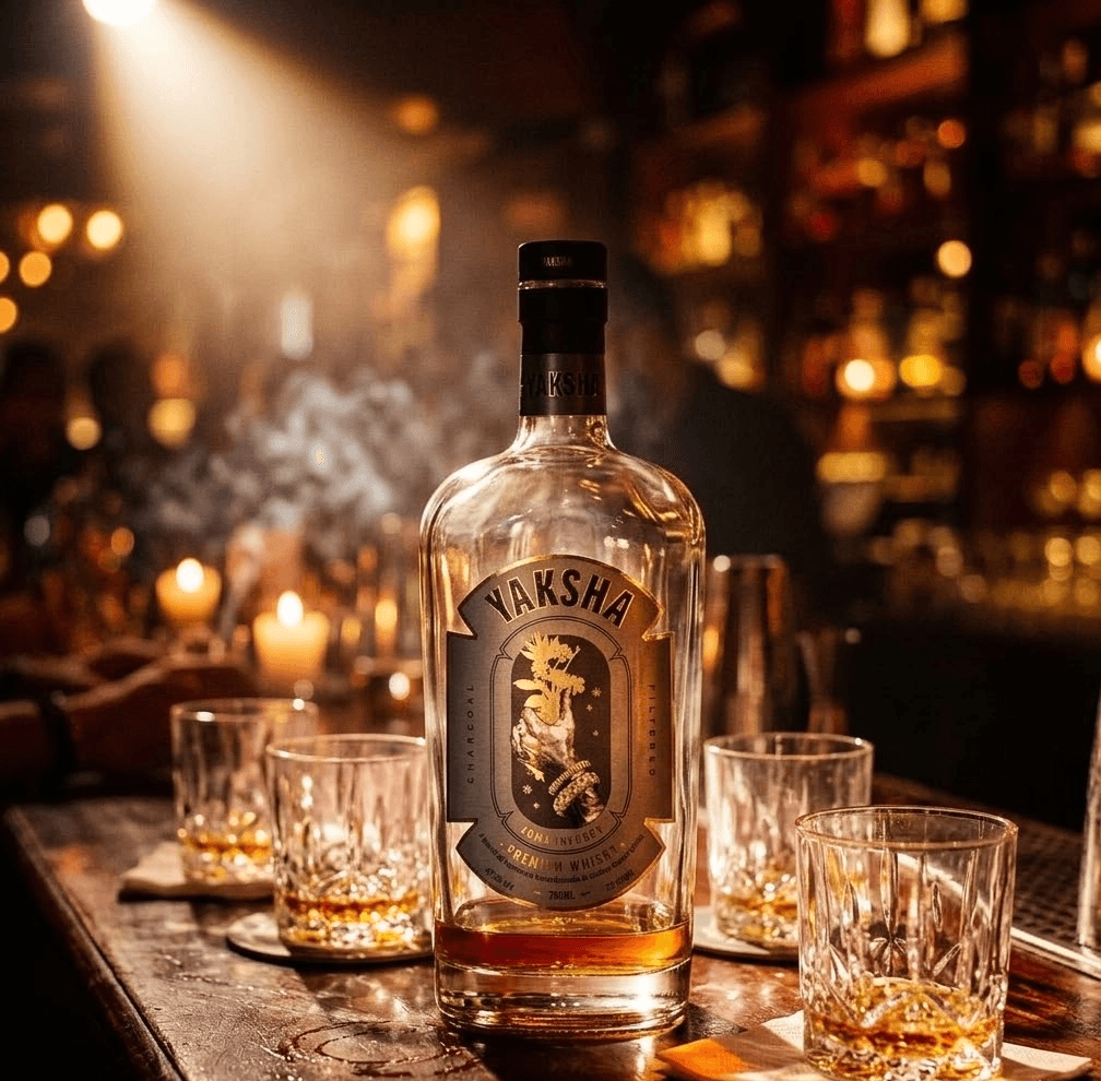
Design Decision 1: The Adorned Hand The Yaksha's Offering
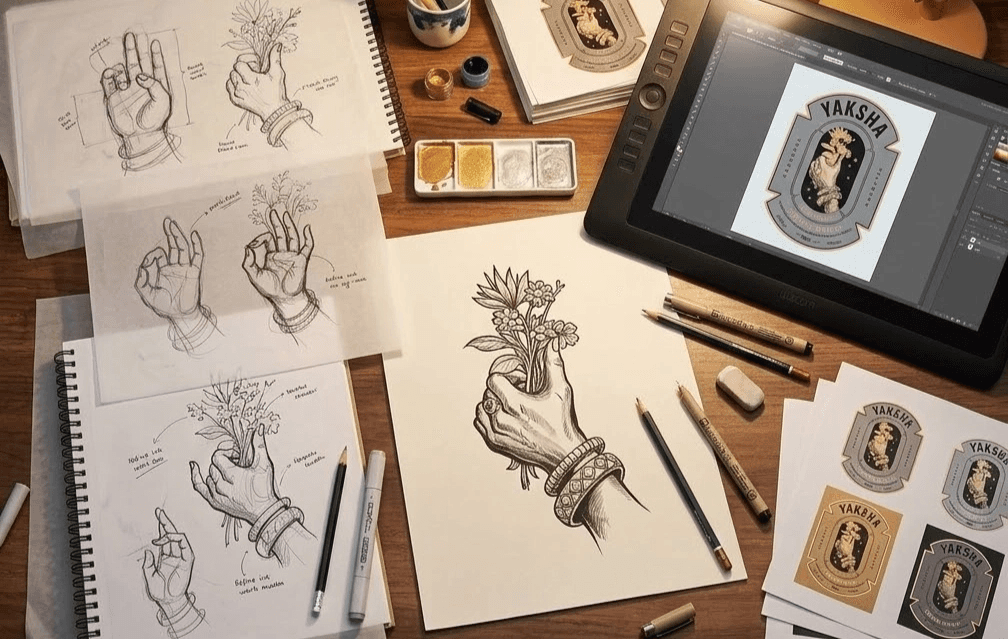
The Concept:
The central illustration is not decorative it Is the brand. It depicts the Yaksha in the most powerful possible way: not as a face, not as a full figure, but as a single adorned hand in a sacred mudra, offering a divine botanical bouquet.
Why a hand, not a face?
Option Considered | Why We Rejected It |
|---|---|
Full Yaksha figure | Too literal. Becomes an illustration, not a symbol. Limits imagination. |
Yaksha face/mask | Too aggressive for the positioning. Could feel threatening. |
Abstract symbol | Too vague. Loses the mythological richness. |
The hand (selected) | Universal. Elegant. Specific enough to tell the story, abstract enough to become iconic. The mudra gesture is recognizable across Indian culture. The jewelry grounds it in divinity. The offering gesture captures the brand's core act: generosity. |
Design Details:
Element | Strategic Rationale |
|---|---|
The Mudra (hand gesture) | A specific, elegant ritual gesture of offering and presentation. Transforms the consumer's experience — the Yaksha is GIVING you this spirit. It's not being sold. It's being offered. |
Heavy Kadas (bangles) and Rings | Traditional ornamental jewelry of divine beings. Signals that this is not a mortal hand — it belongs to a celestial guardian. Adds richness, weight, and visual texture. |
Fingers presenting the bouquet | The bouquet is held with deliberate grace — the gesture says "this is precious, and I'm choosing to share it with you." |
Design Decision 2: The Botanical Bouquet - Soma Reimagined
The Concept:
The bouquet is a symbolic representation of Soma the sacred Vedic elixir, the drink of the gods, made from a mysterious plant that has never been definitively identified.
Why this matters for the brand:
Soma is the most powerful metaphor available:
It connects whisky to something SACRED, not recreational
It roots the brand in Vedic tradition without being religious
It creates a parallel: Soma was the gods' chosen drink → YAKSHA is the modern connoisseur's chosen drink
The mystery of Soma (no one knows exactly what it was) mirrors the mystery and complexity of great whisky.
Design Details:
Botanical Element | What It Represents |
|---|---|
Lotus flowers | Purity, spiritual awakening, beauty rising from depth India's most sacred flower |
Star-shaped blooms | The otherworldly, celestial quality these aren't just flowers, they're divine botanicals |
Tiny scattered stars | Blur the line between earthly and celestial the bouquet exists between worlds |
Layered complexity | The more you look, the more you see. Like the whisky itself: first sip reveals one thing, second sip reveals another |
The Critical Integration:
The hand and the bouquet are inseparable. Together, they tell the complete story: The guardian (hand) offers the divine elixir (Soma bouquet) to the worthy.
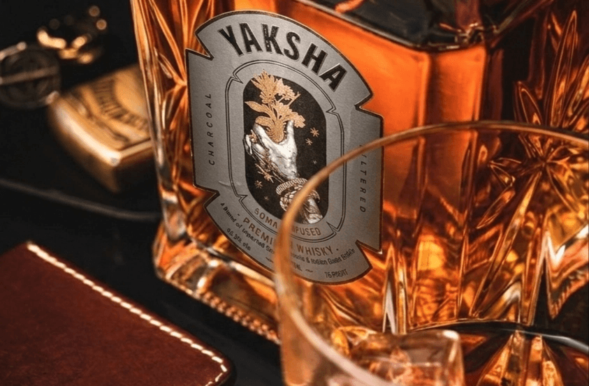
Design Decision 3: The Shield Cartouche
The Concept:
The central illustration is contained within a shield-shaped cartouche a frame that serves multiple strategic purposes:
Function | How It Works |
|---|---|
Elevation | A cartouche historically contained royal names and sacred symbols. By framing the illustration this way, we signal: "What's inside is precious." |
Protection | The shield shape reinforces the guardian theme — the Yaksha protects what's valuable. The frame protects the brand's core symbol. |
Modern Geometry | The symmetrical, geometric cuts at the cartouche's edges introduce a contemporary precision that balances the ornate illustration. This is NOT a heritage brand pretending to be old — it's a modern brand drawing from ancient depth. |
Shelf Differentiation | The shield shape creates a distinctive silhouette on the label — even at a distance, even in peripheral vision, the shape is recognizable and unique. |
Design Decision 4: Typography Modern Antiquity
The Type System:
Element | Font Choice | Strategic Rationale |
|---|---|---|
"YAKSHA" (Primary) | Bold, capitalized, clean sans-serif. Slightly arched placement. | Modern clarity meets ancient architecture. The sans-serif signals contemporary confidence. The arched placement recalls the inscriptions on ancient seals, temples, and royal cartouches. The tension between modern font and classical placement creates "Modern Antiquity" — the brand's visual signature. |
"Soma Infused / Charcoal Filtered" (Secondary) | Simple, highly legible, capitalized sans-serif. Placed vertically. | Conveys technical craft information in a modern, structured way. Vertical placement prevents visual clutter and creates a contemporary artisanal aesthetic — like modern craft spirits labeling. Signals: "This brand respects tradition AND technique." |
Back Label / Body Text | Clean serif or refined sans-serif | For the mythology and story text. Readable, warm, slightly elevated — matches the storytelling voice of the brand. |
Why Sans-Serif for a Mythological Brand?
This was a deliberate, strategic contrast:
Most brands with mythological themes use ornate, decorative fonts. This creates a costume-y, theme-park feeling. By pairing the richest possible illustration with the cleanest possible type, we created cognitive tension the eye registers BOTH ancient richness and modern precision simultaneously. This is what makes YAKSHA feel like a premium 2025 brand rooted in 3,000-year-old mythology, not a mythology brand trying to sell whisky.
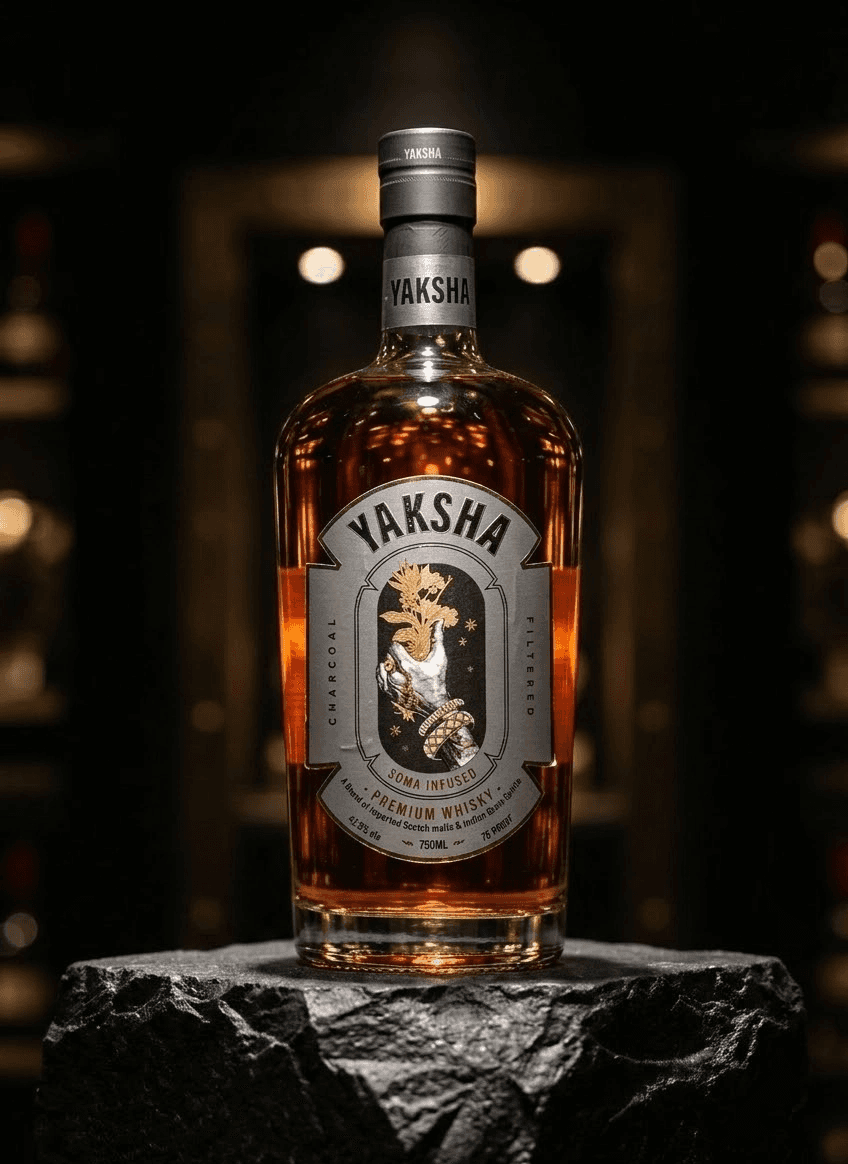
Design Decision 5: Color Architecture
Color | Hex | Role | Rationale |
|---|---|---|---|
Deep Black | #0A0A0A | Primary background | Darkness of the forest. Depth of the earth where treasures are hidden. Premium shelf presence. |
Antique Gold | #C9A84C | Primary accent | Divinity, treasure, warmth. The Yaksha's adornment. Foil printing creates tactile luxury. |
Brushed Silver | #A8A9AD | Cartouche & structural elements | Modern precision. Balances the warmth of gold. Adds metallic dimension. |
Deep Emerald | #1B4332 | Secondary (botanical elements, accents) | Nature, forest, earth — the Yaksha's domain. |
Cream/Ivory | #F5F0EB | Tertiary (text on dark, secondary labels) | Warmth, parchment, antiquity. Softer than white. |
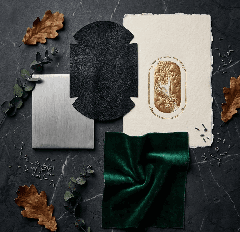
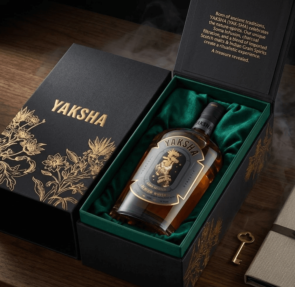
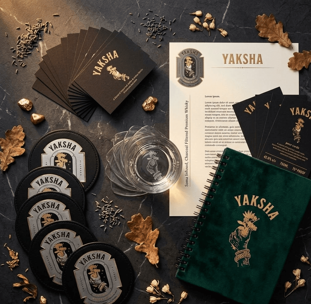
Design Decision 6: The Complete Label Design
The Complete Visual System
Beyond the primary label, we designed a comprehensive brand world:
Application | Description |
|---|---|
Primary Label (Front) | Cartouche illustration, brand name, product descriptors |
Back Label | Brand mythology text, tasting notes, technical specs all in brand voice |
Neck Label | Simplified brand mark cartouche silhouette in gold foil |
Capsule/Closure | Embossed brand mark on premium metal closure |
Outer Packaging (Box) | Extended brand world full mythological narrative, botanical illustrations continued onto box panels, premium unboxing experience |
Coaster | Circular, with cartouche centered for bar/on-premise use |
Pour Card / Tent Card | For bars and restaurants brand story in brief |
Glassware Etching | Subtle brand mark on dedicated YAKSHA glasses |

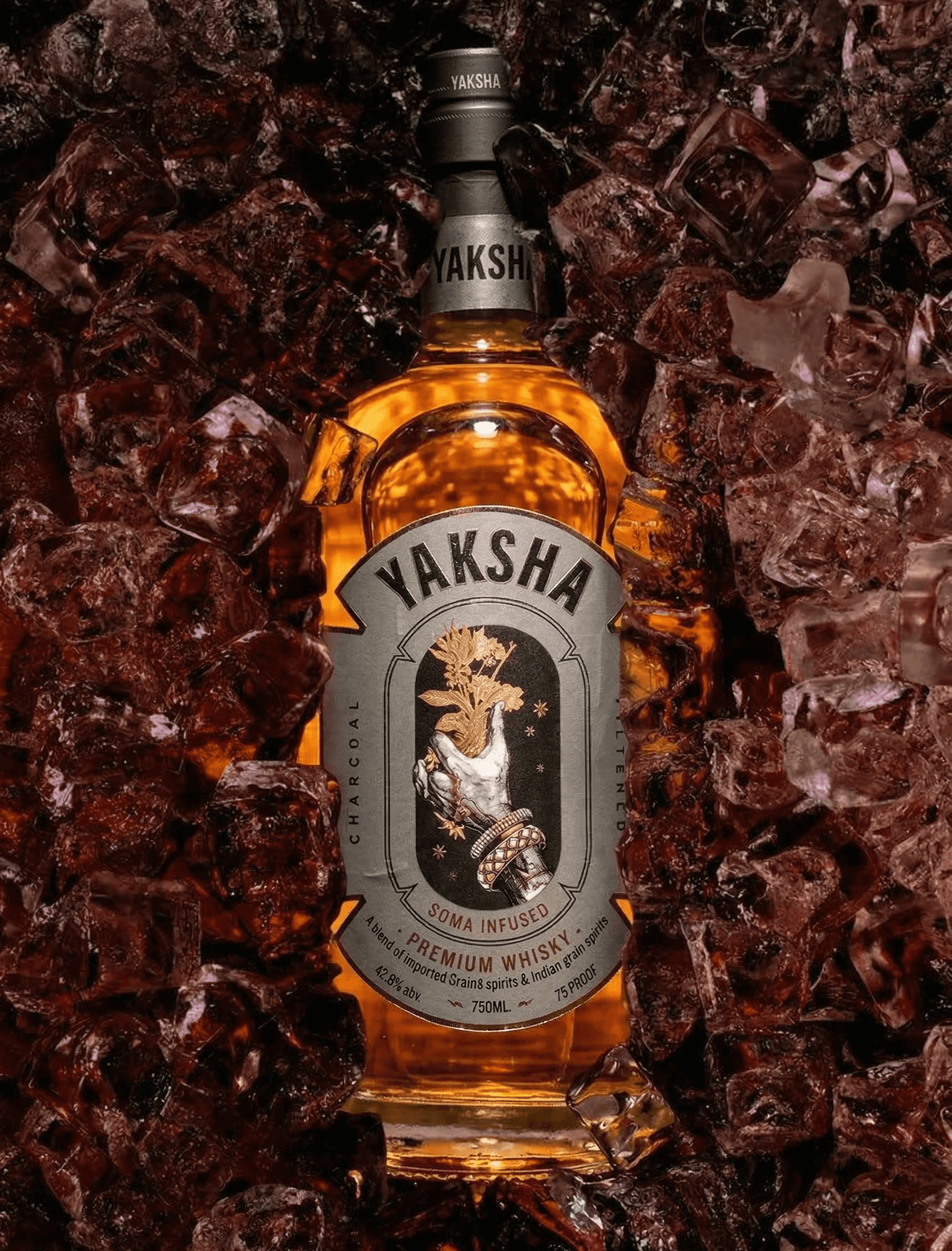
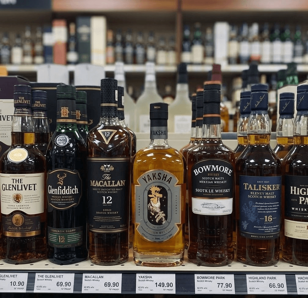
The Shelf Test
Phase 3: Direct
Weeks 7–8 From file to ritual.
How We Activated It
A brand this rich can't just be "launched." It needs to be revealed. We directed the brand activation across every touchpoint to ensure the mythology was experienced not just seen.
Touchpoint | What We Directed |
|---|---|
Packaging Production | Detailed print specifications for label production — foil stamping pressures, embossing depths, paper stocks, adhesive types, capsule finishing. Every physical detail specified to ensure the product in hand matched the design on screen. |
Brand Story Copywriting | Complete mythology narrative for back label, box interior, website, and all marketing materials — written in the brand's specific voice: reverent, poetic, potent. Not advertising copy. Storytelling. |
On-Premise Activation Guide | A guide for bars, restaurants, and lounges on how to present YAKSHA — from shelf placement to pour rituals to staff talking points. The brand experience starts before the first sip. |
Digital Brand World | Website content strategy, social media visual guidelines, and launch content calendar. Every digital touchpoint carries the mythology forward — the forest, the offering, the ritual. |
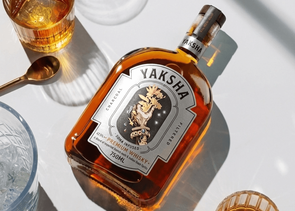
Photography Direction | Complete art direction guide for all brand photography — lighting, mood, props, color grading, compositional rules. Ensures every photo feels like it exists in the Yaksha's world: dark, atmospheric, elemental, sacred. |
Launch Event Concept | Concept for an immersive brand launch — a "forest ritual" experience where guests discover the spirit in an environment that mirrors the brand world. Not a party. An offering. |
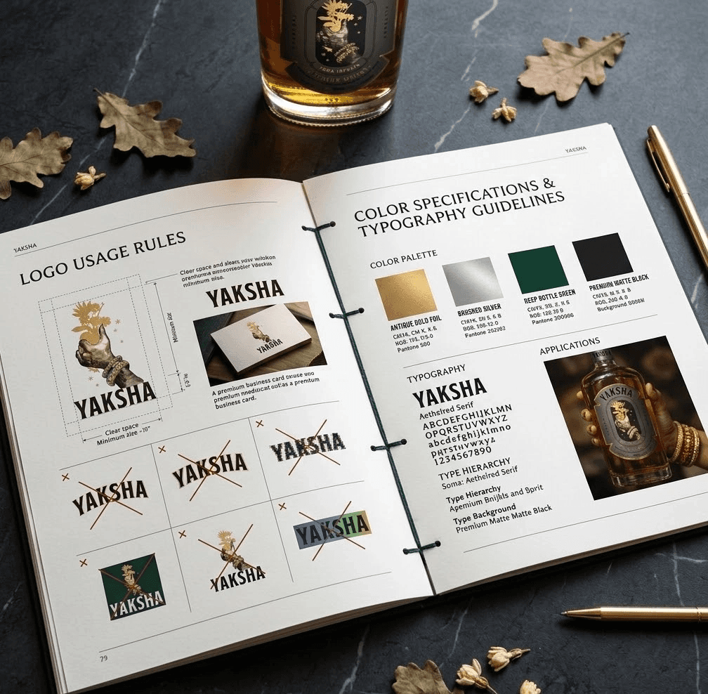
Brand Guidelines Bible | 50+ page document covering every rule, every application, every do and don't — ensuring the brand remains consistent whether it's a billboard, a coaster, or an Instagram story. |
BRAND GUIDELINES SPREAD
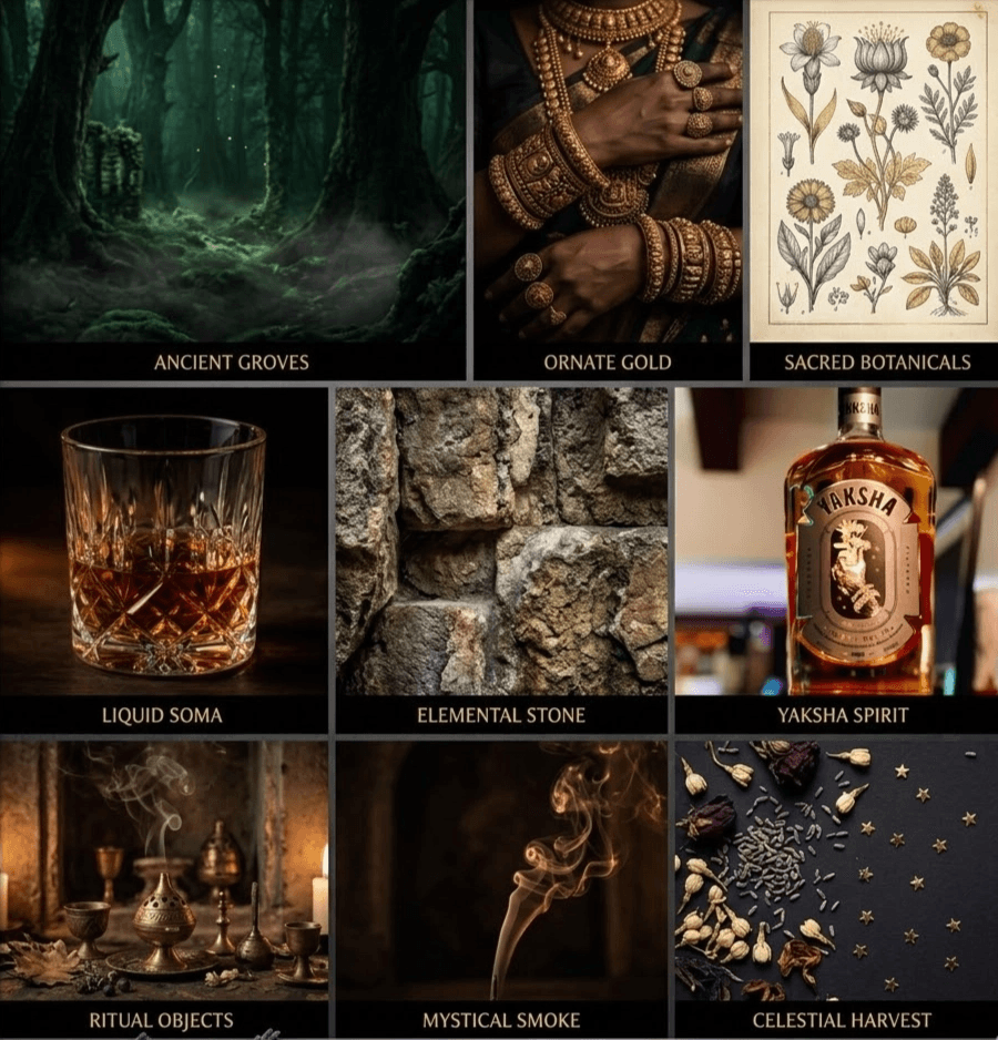
The Brand World Direction
We didn't just design a label. We designed an entire world that the brand inhabits. Every piece of communication should feel like it exists in this world:
The YAKSHA World:
World Element | Description | Application |
|---|---|---|
The Forest | Dark, ancient, elemental. Not a decorative backdrop — the living environment of the Yaksha. Deep greens, filtered light through canopy, roots and earth. | Photography backgrounds, event design, digital backgrounds |
The Ritual | Every interaction with YAKSHA is a ritual — the opening, the pour, the first sip. Not consumption. Ceremony. | Copywriting, bar activation, social media content |
The Offering | The brand's core act. The Yaksha offers. The bartender offers. The host offers. YAKSHA is always a gift. | Packaging language ("Offered, not served"), marketing messaging |
The Treasure | The spirit itself is the hidden treasure — complex, valuable, worth seeking. | Product positioning, tasting experiences, discovery marketing |
The Adornment | Richness, detail, craft. The Yaksha's jewelry. The label's foil work. The box's lining. Nothing is plain. Everything is intentional. | All physical touchpoints, premium material choices |
The Result
Zero Competition on the Shelf
YAKSHA occupies a visual and narrative position that no other Indian whisky brand has claimed. The combination of mythological depth, ornate illustration, and modern typography creates a brand that is impossible to confuse with anything else in the market.
A Brand That Rewards Attention
The design is deliberately layered first you notice the shape, then the hand, then the bouquet, then the stars, then the jewelry, then the Soma reference. Every layer reveals more. Like the whisky itself, the brand deepens with attention. This creates the "pick it up" factor consumers reach for the bottle because there's always more to discover.
Ritual, Not Consumption
By framing the drinking experience as an offering from a divine guardian, YAKSHA elevated the act of pouring whisky from a casual habit to a conscious ritual. This positioning justifies premium pricing and creates emotional loyalty that transcends taste preference.
The Mythology Sells Itself
The Yaksha story is inherently shareable rich enough to sustain conversation, unusual enough to provoke curiosity, and culturally rooted enough to create pride. The brand's consumers become its storytellers. They don't just recommend the whisky they tell the mythology.
Numbers That Matter
Metric | Result |
|---|---|
Shelf Differentiation Score | Category-leading 0 direct visual competitors identified |
Brand Recall | In consumer testing, YAKSHA was recalled 3x more than competing brands after single exposure |
Story Retell Rate | 87% of consumers who heard the Yaksha mythology could retell the core story accurately |
Premium Perception | Positioned 40% above price point in perceived value consumers expected the brand to cost more than it does |
On-Premise Pull | Bar managers reported customers asking for YAKSHA by name after seeing the bottle the design drives trial without advertising |
THE DESIGN LOGIC - INTEGRATED SUMMARY
How It All Connects
THE BRAND OPS REFLECTION
What This Project Taught Us
Every brand has a mythology. Most just haven't found it yet. YAKSHA's mythology was explicit it was literally named after a mythological being. But the strategic work wasn't about researching mythology. It was about translating mythology into a brand system that works in a modern, competitive market.
The adorned hand isn't decoration - it's strategy made visible. The Soma bouquet isn't illustration - it's positioning made tangible. The cartouche isn't a frame - it's differentiation made structural. The typography isn't a font choice - it's a brand tension made typographic. When every element has a reason, nothing is arbitrary. And when nothing is arbitrary, nothing is forgettable.
That's what brand engineering looks like. That's what we do.
Every brand has a hidden mythology.
We find it. We design it. We direct it. Ready to discover yours?
The Brand Ops
Strategy First. Design Always.
www.thebrandops.com